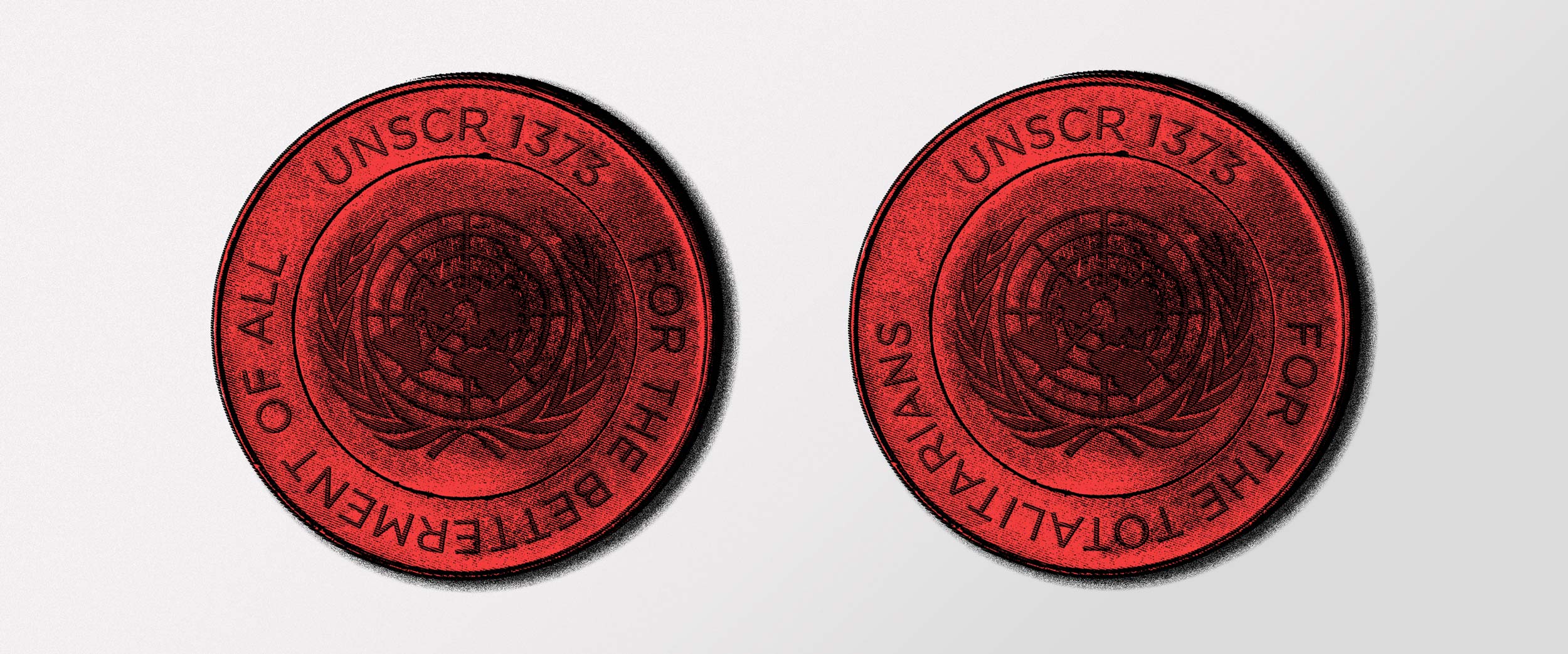
Within International has always been about brands. Creating brands is capturing the essence of a firm. It is about understanding the people in their individuality and as a whole. It is about understanding how to combine the human and the professional elements so that the brand is a truthful and vibrant expression of people and business.
A well-done brand is a business asset that gives its people the best chance to express the values they bring to their clients and the reassurance that the firm at a higher-level values them enough to invest in delivering this value.
We isolated the Peters & Peters ampersand and turned it into an emblematic sculpture that is at the foundation of the new brand.
Brand has a special place in our agency’s heart because it is the highest opportunity our clients have to be brave, stand out, and portray themselves as they actually are: highly trained experts, sophisticated in their thinking and the outputs of their work. And this field has always been the spark for some of our most iconic work. This one is no exception.
We were delighted when Peters & Peters, the leading UK law firm in business crime and civil fraud, commissioned Within International to work on their rebrand. This gave us the platform, once again, to show that a high-end, sophisticated, exciting approach will consistently deliver. Gone are the days when professional services brands need to be bland.
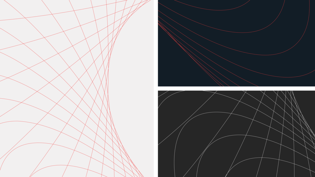
Detailed crops of the line work forming the ampersand are used as a graphic device across collateral.
Our mission was complicated and delicate. Peters & Peters are highly regarded in the legal sector and respected for their human-centred practice formulating brilliant work on complex and sensitive cases. These cases are varied, and so are the skills required to defend them. Working hand in hand with Richard Gerrard, Director of Business Development and Marketing, our team has delivered a complete rebrand – scanning all touchpoints, considering all channels, and involving all parts of the business to shape a traceable, notable and spot-on brand. We have given particular attention and care to their website to build a window into their culture and work, and intuitive, engaging, and straightforward ethos.
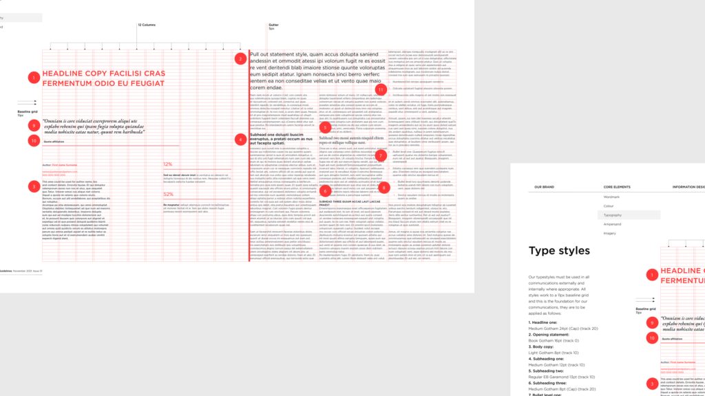
The new brand guidelines provide guidance on typography and grids.

The Peters & Peters colour palette is not just visualised as flat tones, but as a 3D manifestation of the brand.
Peters & Peters are viewed not only as passionate experts and meticulous specialists, but they go to extraordinary lengths on behalf of their clients – and this engagement resonated with our process. We are firm believers that brands are a business asset and take pride in the research we undertake during a body of work of that magnitude to deliver a practical yet sophisticated and beautiful brand. Our approach to getting a deep understanding of Peters & Peters, what they do and who they are, revealed the most open group of senior clients that we have had the pleasure to work with. Led by Michael O’Kane, Senior Partner, Keith Oliver, Head of International, Helen McDowell, Managing Partner, and Jonathan Tickner, Head of Fraud and Commercial Disputes, the firm shared an incredible amount of invaluable information to feed our creative work.

Close crops of the 3D ampersand show the colour palette brought to life.
It has become our style to produce distinctive and uncommon brands.
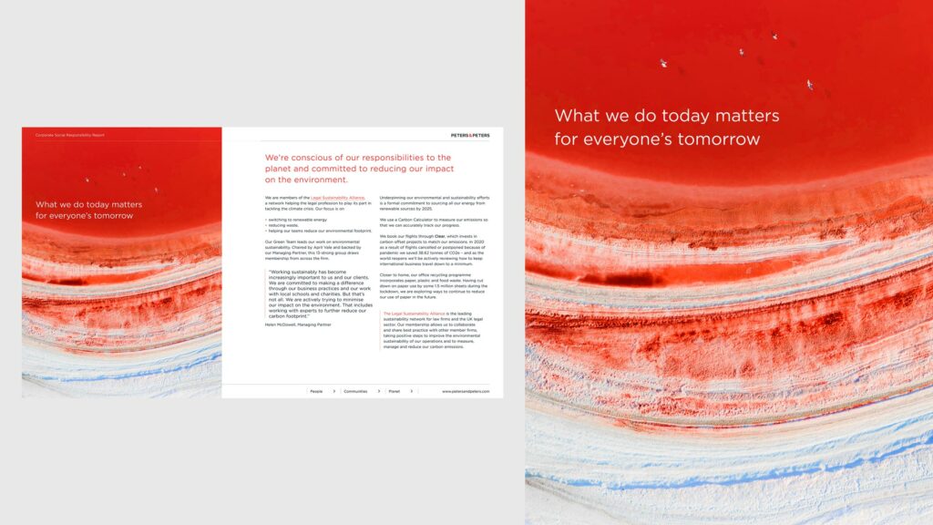
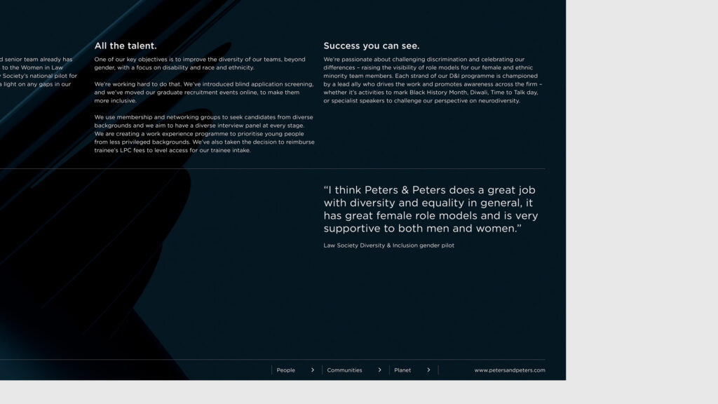
Pages from the Peters & Peters CSR report showing the brand assets in action.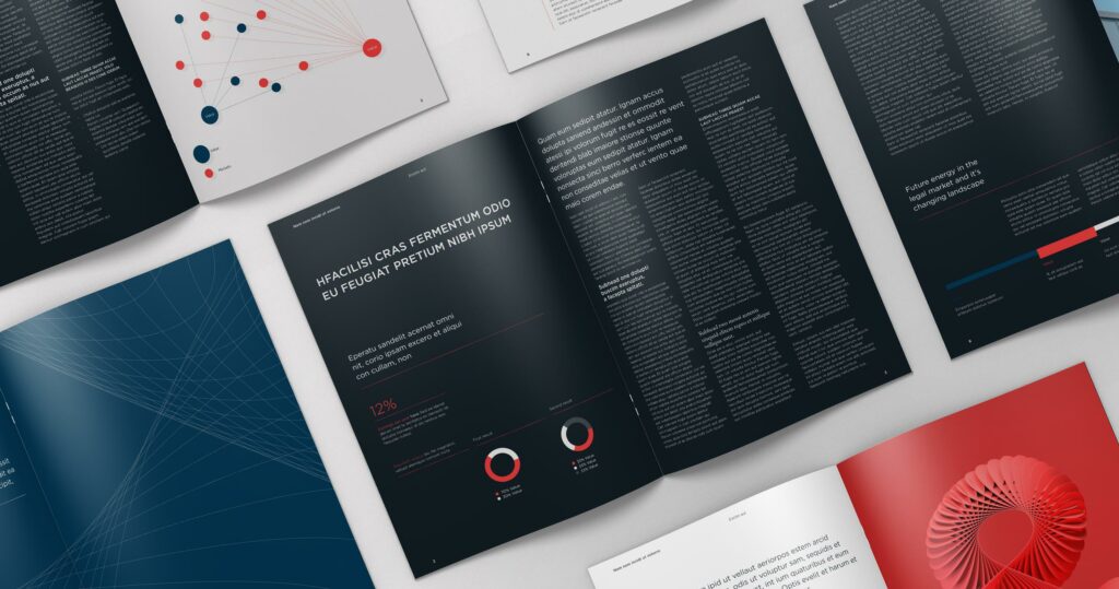
Brochure spreads demonstrate all the elements of the brand working together.
For this project, we decided to focus on the firm’s binary aspect, from their name, Peters & Peters, to their practice, business crimes and civil matters, and their ability as a firm to handle both brilliantly. To further bring out their uniqueness and astuteness, we created a sub-brand with a singular look for their regional flashpoints campaign. As a result, we isolated the ampersand and turned it into an emblematic sculpture as the foundation of the distinctive look and feel of the new brand.
Bespoke illustrations created for the regional flashpoints campaign
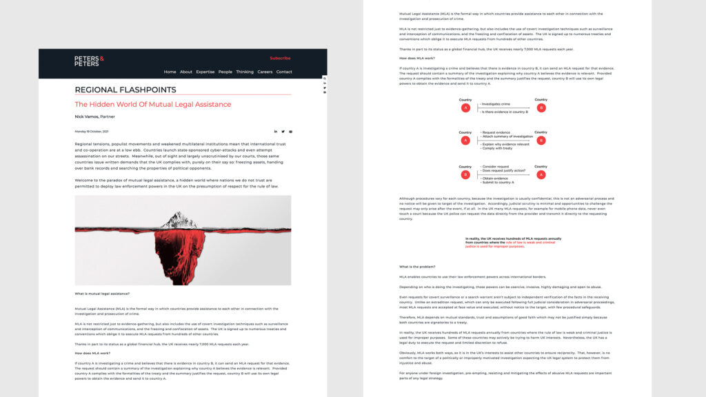
A page from the regional flashpoints section of the website.
A brand that stands out, that is clever, converging at the apex of human, business, expertise and care could only have been creatively directed by Will Hambling, our Creative Director and Founder. “The way Will ideates brands is a process I have witnessed many times, yet I am never not surprised by it. It is the sort of magic that reveals itself layer by layer, and it is just amazing when you get to step back and look at it in its entirety. The unpredictability of the process is a thing of beauty,” Ruxandra Radulescu, our CEO declares.
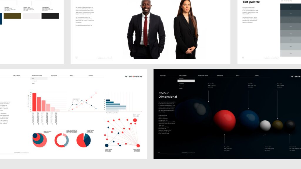
Example pages from the Peters & Peters brand guidelines.
“We always push our clients to be braver and we know it is a hard mould to break because the world around us has taught us to be cautious. But brave doesn’t mean out of place. It means considered, clever, exciting – a way to get noticed not because you are different, but because you are able to differentiate.”
Will Hambling
Founder & Creative Director at Within International
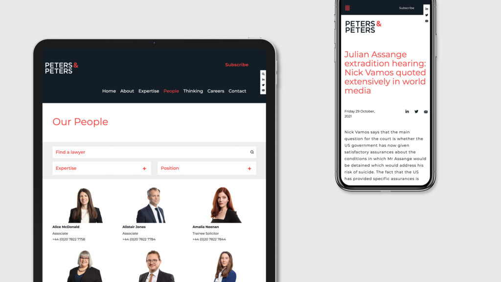
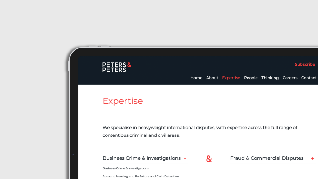
The new Peters & Peters website.
Within International took part in this colossal project at all levels and is now delighted to launch Peters & Peters’ new brand. Engaging with stakeholders in interviews led by Ruxandra Radulescu, creating unique film with Mitul Rajani, our Head of Experiential and Film, the iconic ampersand, delivery of the concepts and revamped website design by Tolley Moloney, Lead Designer, coordinating the work and launch in the studio, led by Kornelia Bala, our Associate Client Director – these were just a few of the steps that led to a successful delivery.
As the first project with a new client goes, this one has been inspiring and stimulating. Certainly, the first of many to pave the way for a wonderful relationship.
Visit the Peters & Peters website.
Distinctive and unique brands for brave clients – whether you’re looking to refresh your visual identity or need a new one altogether, get in touch.

