Global law firm and member of the “Magic Circle” elite, Linklaters LLP approached us at the earliest phase of developing their flexible resourcing programme.
Offering Linklaters’ clients flexible, efficient and cost-effective legal services from contract lawyers, it was evident from the outset that the programme was a creative and practical response to a growing industry demand.
Just the type of project suitable for the thorough market research we apply to our creative process.

As part of our brief, Within International was tasked with naming the programme and creating a mark closely associated with Linklaters’ distinctive and prestigious brand.
As with any project, we began by formulating a rigorous research approach, ensuring we obtained an aerial view of the business and marketplace before diving into work. All initial research that was conducted during a discovery phase was led by peer group analysis and a strong and strategic methodology. This led to the generation of initial ideas and subsequently a naming solution, Re:link, that united stakeholders from multiple levels of the business.
The name was initially inspired by an alumni element from the original brief – meaning, of course, ‘to link [something] again’, but also easily correlated to linking a market demand to a powerful solution and linking flexible talent to Linklaters’ opportunities. As an alternative perspective, the ‘Re:’ signified ‘regarding’ or ‘referencing’ to Linklaters, in order to draw attention to the quality and reputable service the programme provides by being associated with the firm.
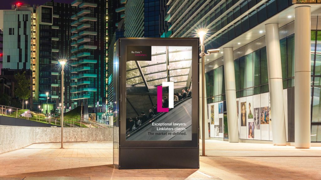
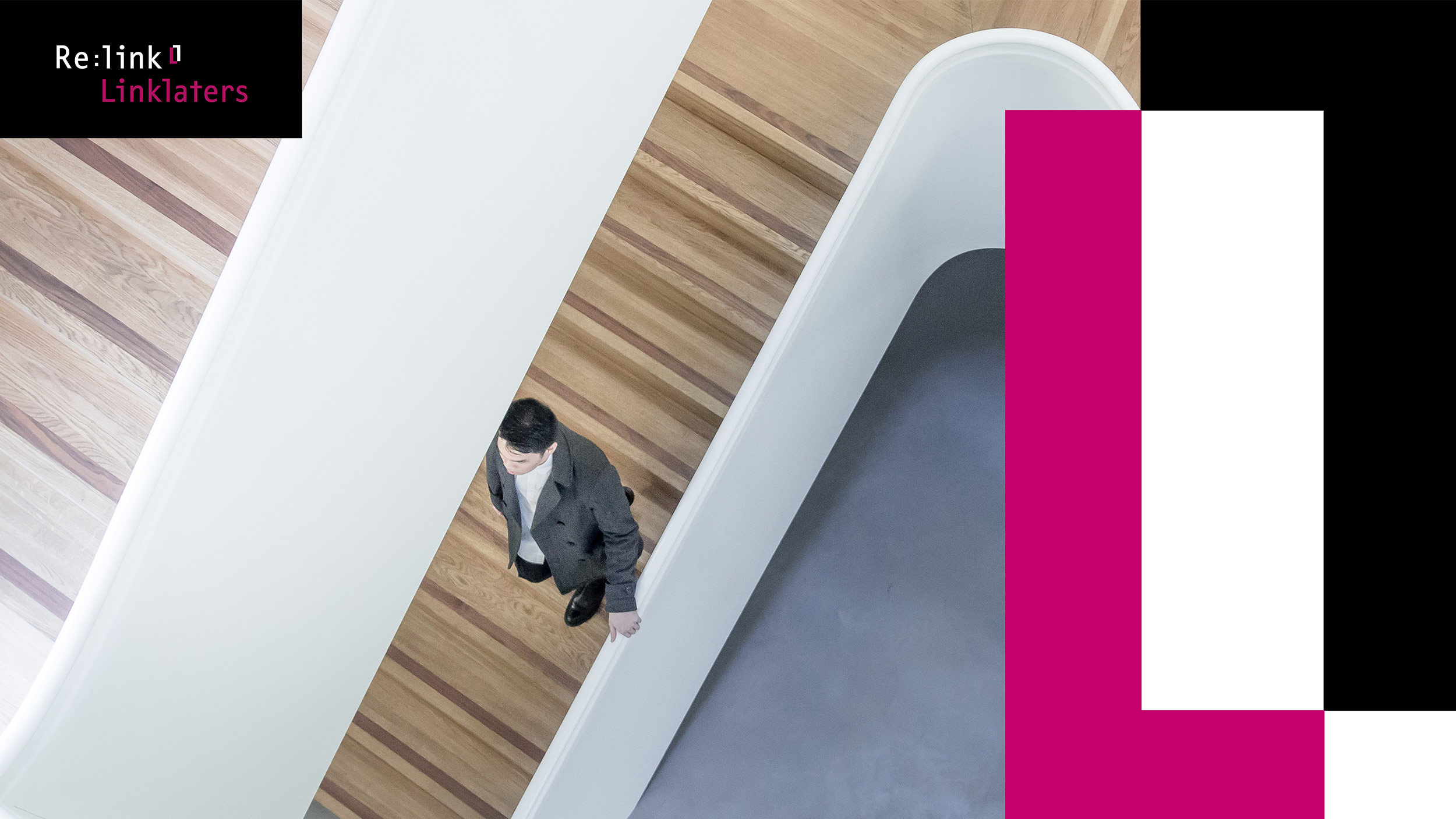
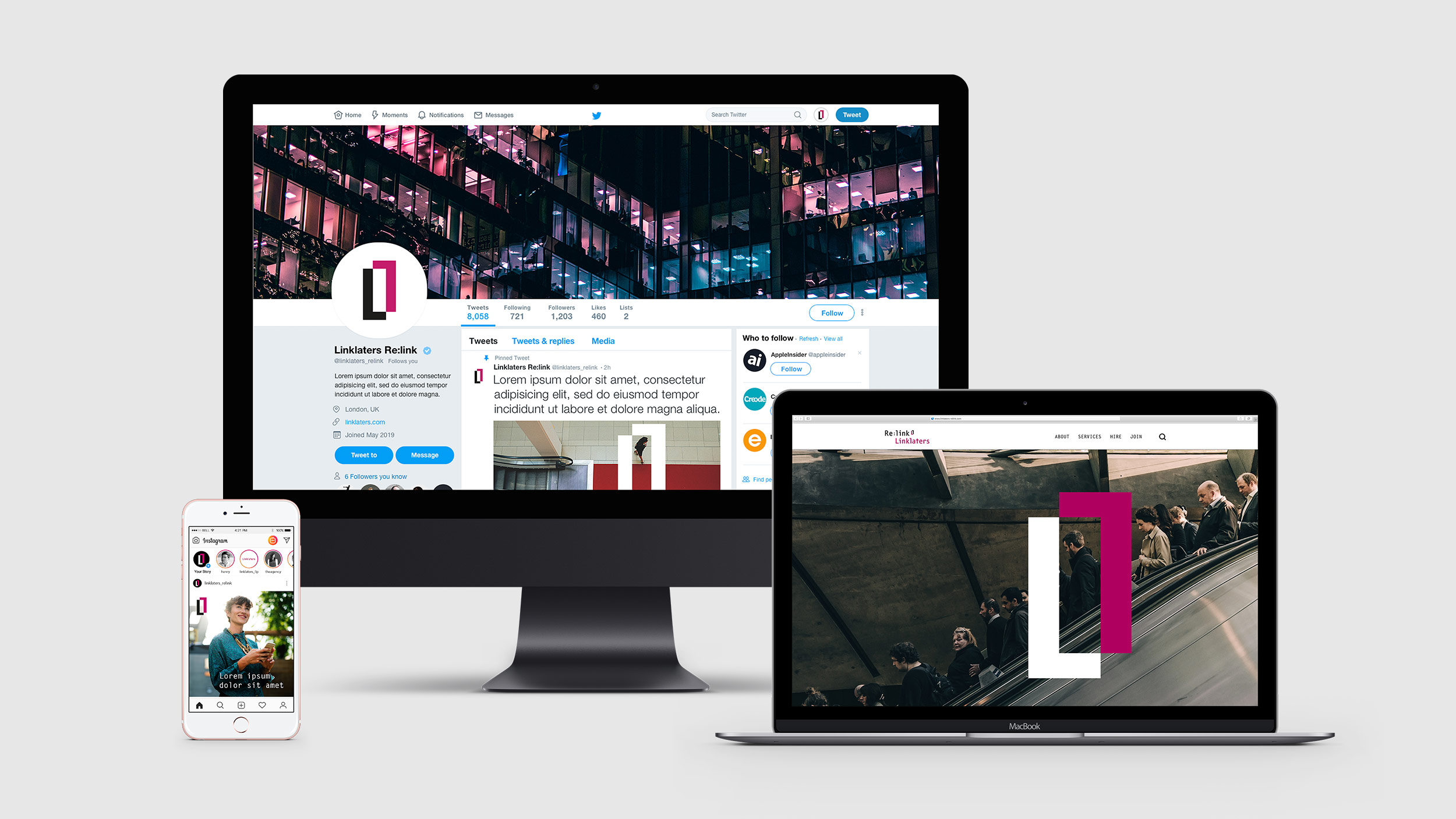
The Re:link mark was created using the same bespoke font used in the Linklaters logo, highlighting the strong connection between the platform and the Linklaters brand. The ‘link’ graphic device was drawn from the shape of the letter ‘i’ in each word and is strategically applied across communication collateral to highlight and frame information. We also combined the mark to form a pattern which is used as a textured background for photography.

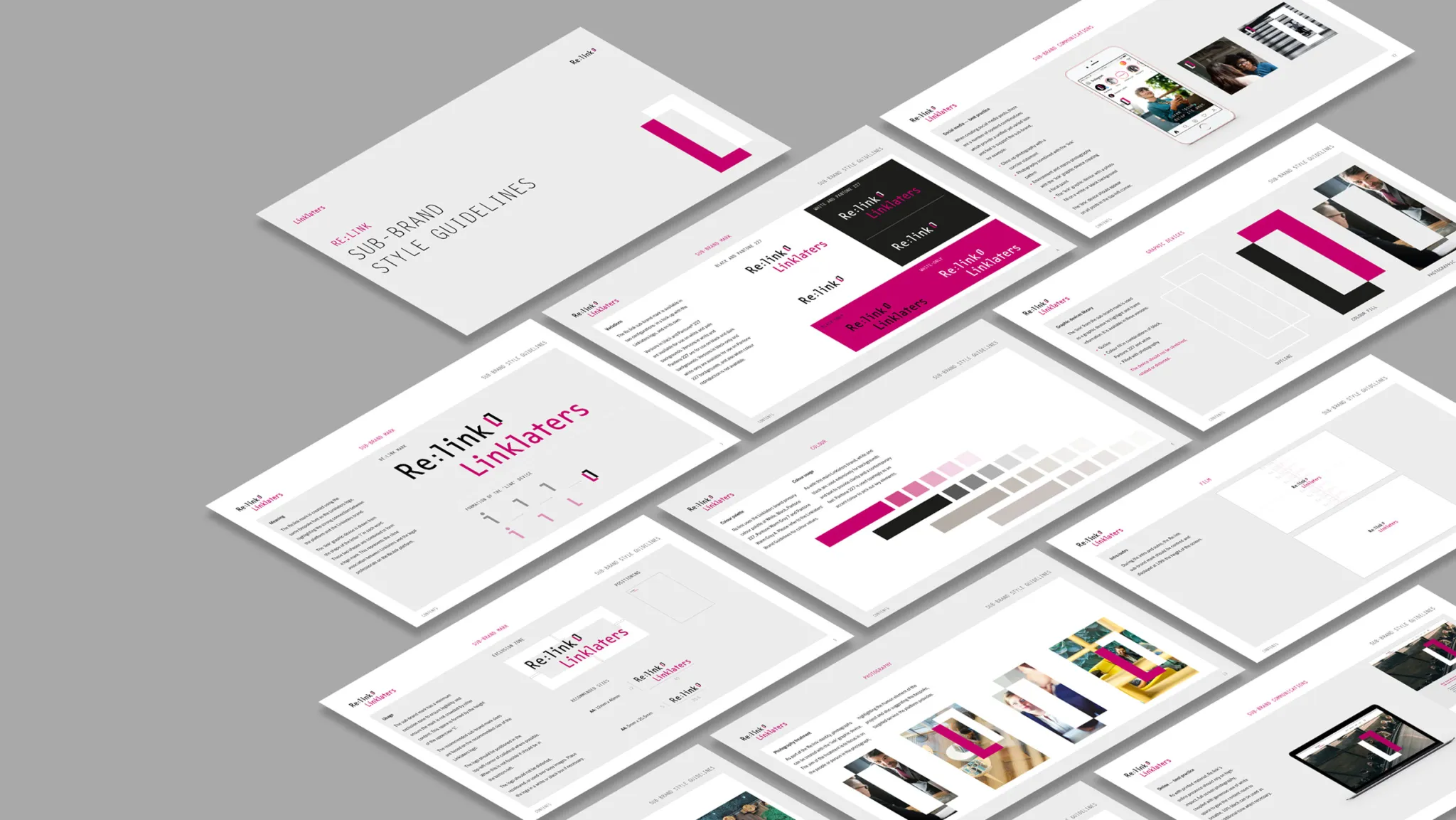
Comprehensive style guidelines created for the Re:link sub-brand.
“The feedback on the visuals and the style guide has been overwhelmingly positive. Thanks for all your hard work.”
Linda Summers / Project Manager
Linklaters
Get in touch
Creating a sub-brand? Our brand experts can help. Get started with us. – get in touch.


