

Advisory, Brand, Film & Animation, Digital

Gleeds is a global construction consultancy. With a heritage spanning more than 130 years, it has played a pivotal role in delivering some of the world’s most significant buildings and infrastructure projects.
Yet, despite this legacy, its presence has often been overshadowed by the projects themselves in an industry where physical outcomes speak louder than the consultants who help shape them.
The challenge, therefore, was to create a brand that revealed not just what they do, but how they think – and how their services shape outcomes. A brand grounded in heritage but designed for relevance and reinvention.
Gleeds needed a brand that could match the scale, complexity and endurance of their work. One that felt as robust, adaptable and enduring as the environments they help create.
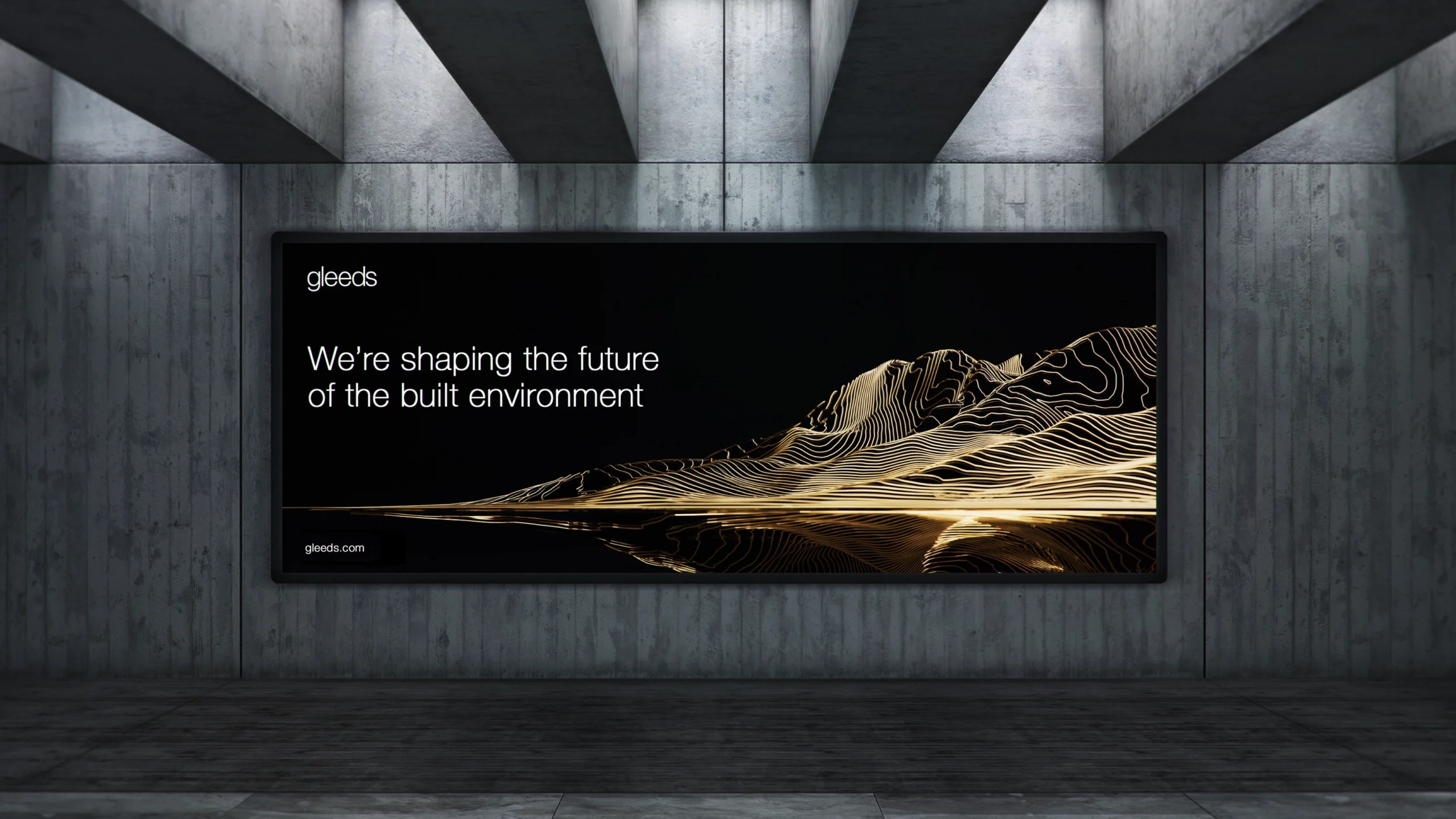
A brand that builds on legacy – and reshapes what comes next
We began by asking a simple but profound question: what if the brand behaved like the spaces it helps shape? Out of that idea came a creative strategy that introduced dimensionality not just as a visual motif, but as an entire way of thinking about identity.
We treated the brand not as a static identity, but as a system in motion – evolving, interlocking and architecturally precise.
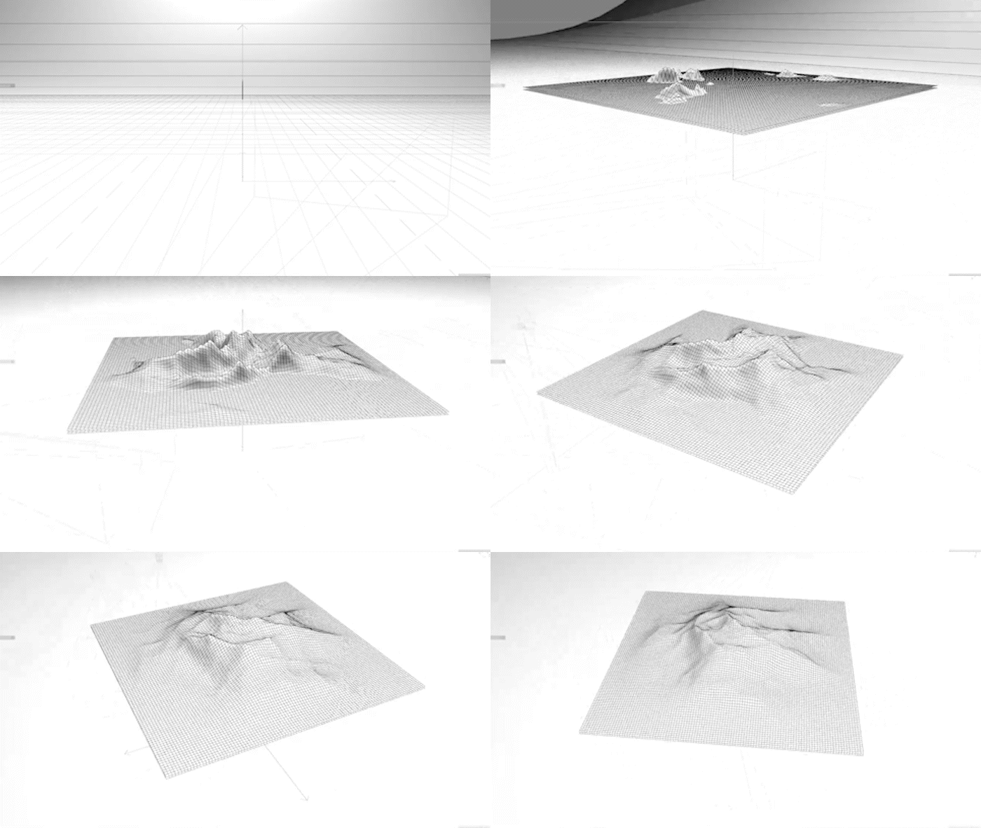
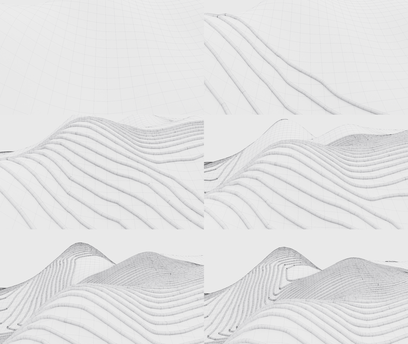
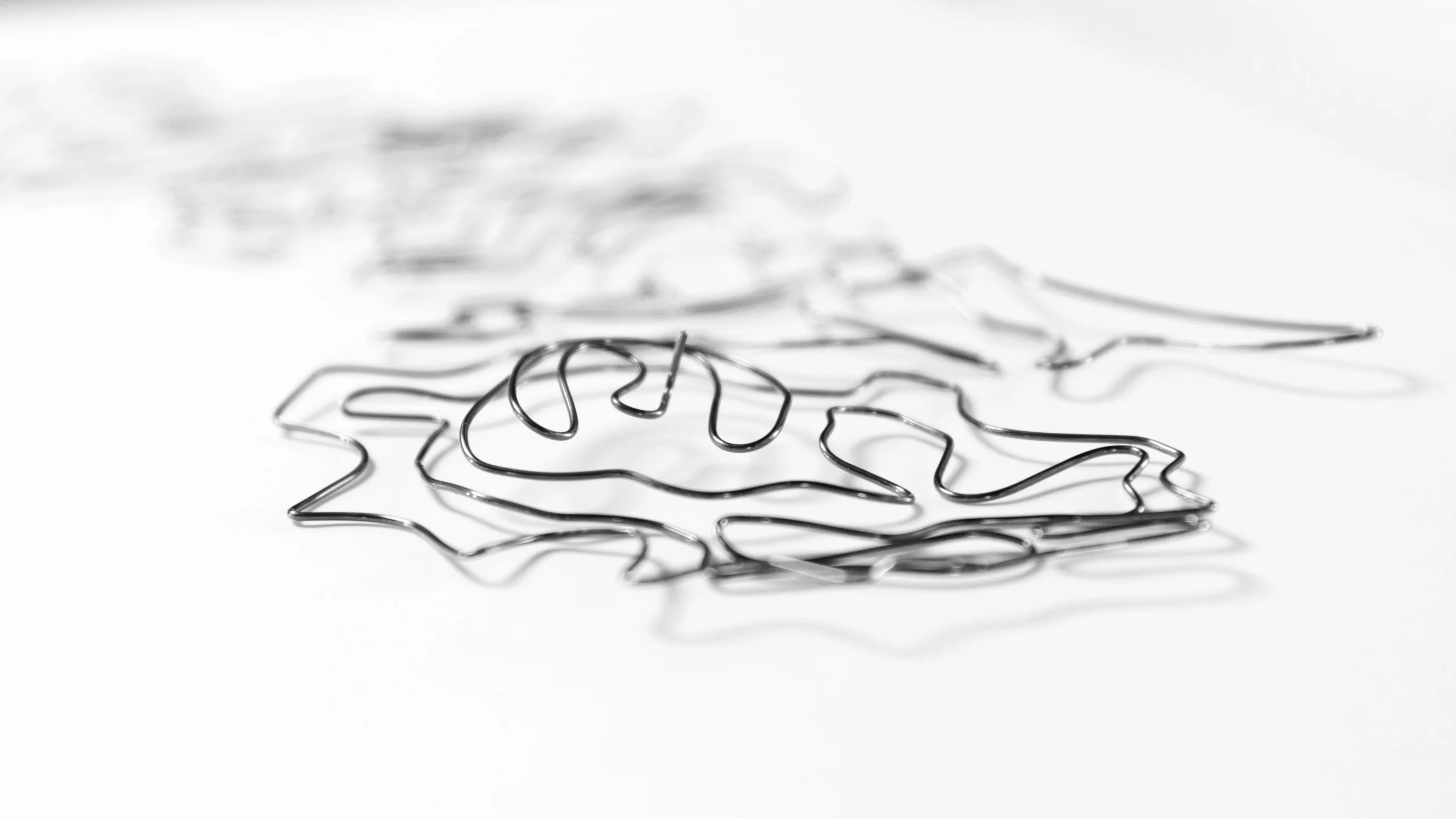
At the heart of the system is a bespoke three-dimensional device we call the Strand. This is conceived as a line that connects two points, faceted and structured like an engineered element, designed to navigate an abstract landscape by intersecting, layering and building over time in much the same way as Gleeds’ services do.
Individually, they represent distinct capabilities. Together, they show the strength of the whole.
The form of the Strand is not smooth or organic; instead, it is angular, faceted and architectural, embodying the precision of construction and the intentionality of Gleeds’ approach to every project.
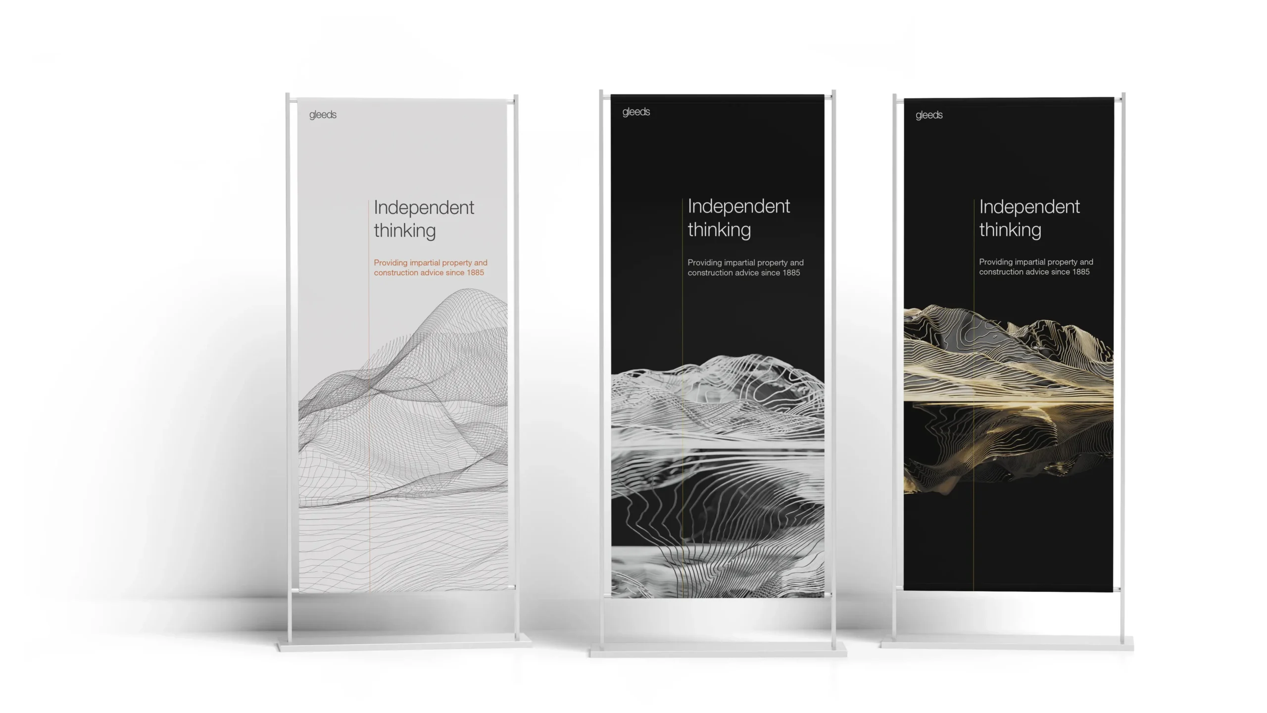
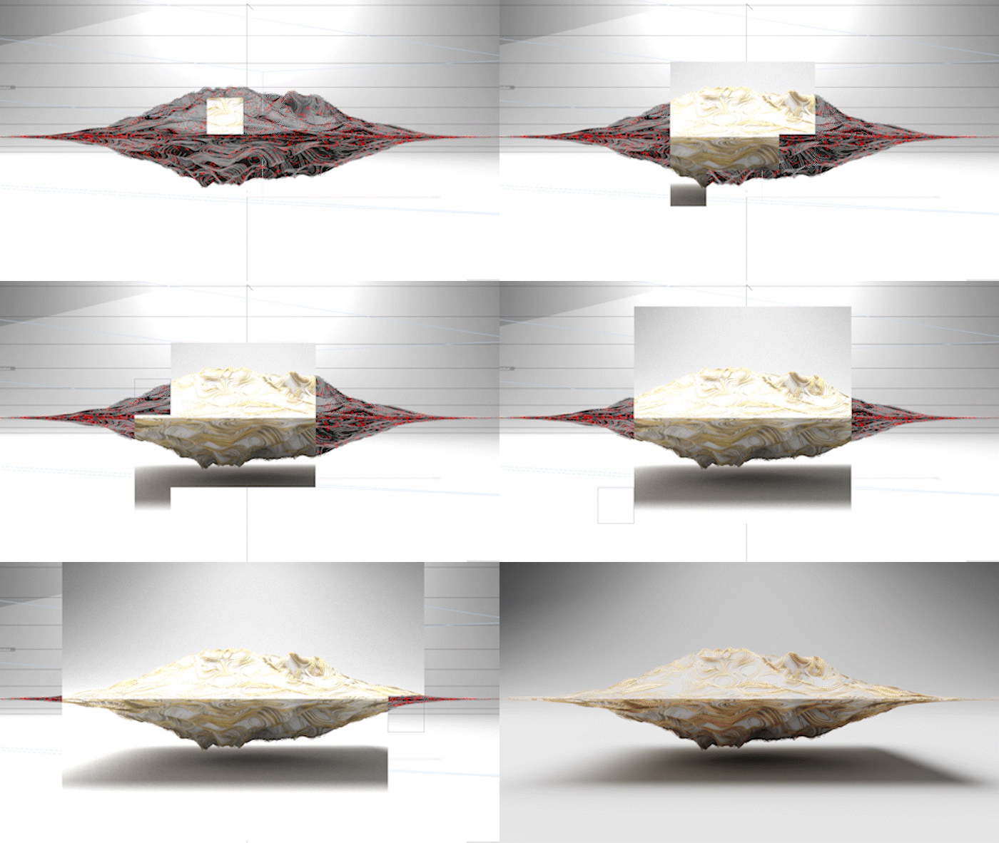
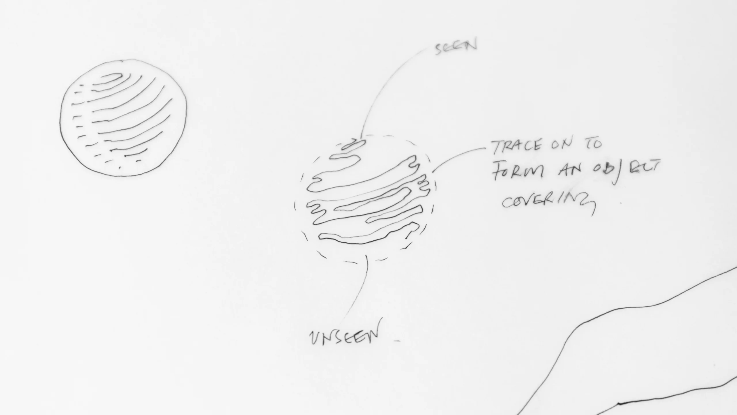
The Strand sits within a wider landscape which takes form of a mirrored terrain – one landscape reflected and inverted on itself to create a continuous loop without beginning or end.


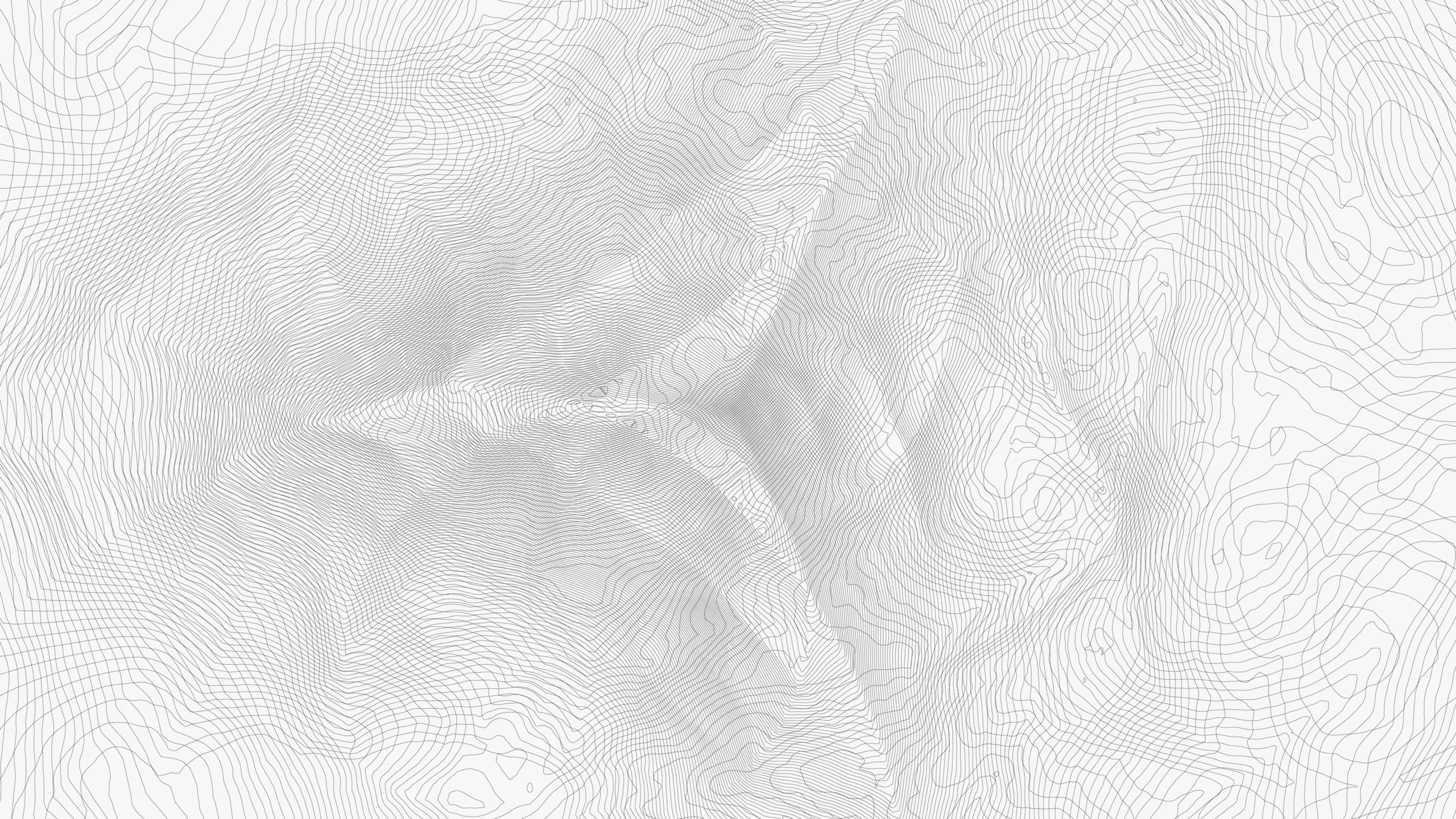

Not just design – infrastructure
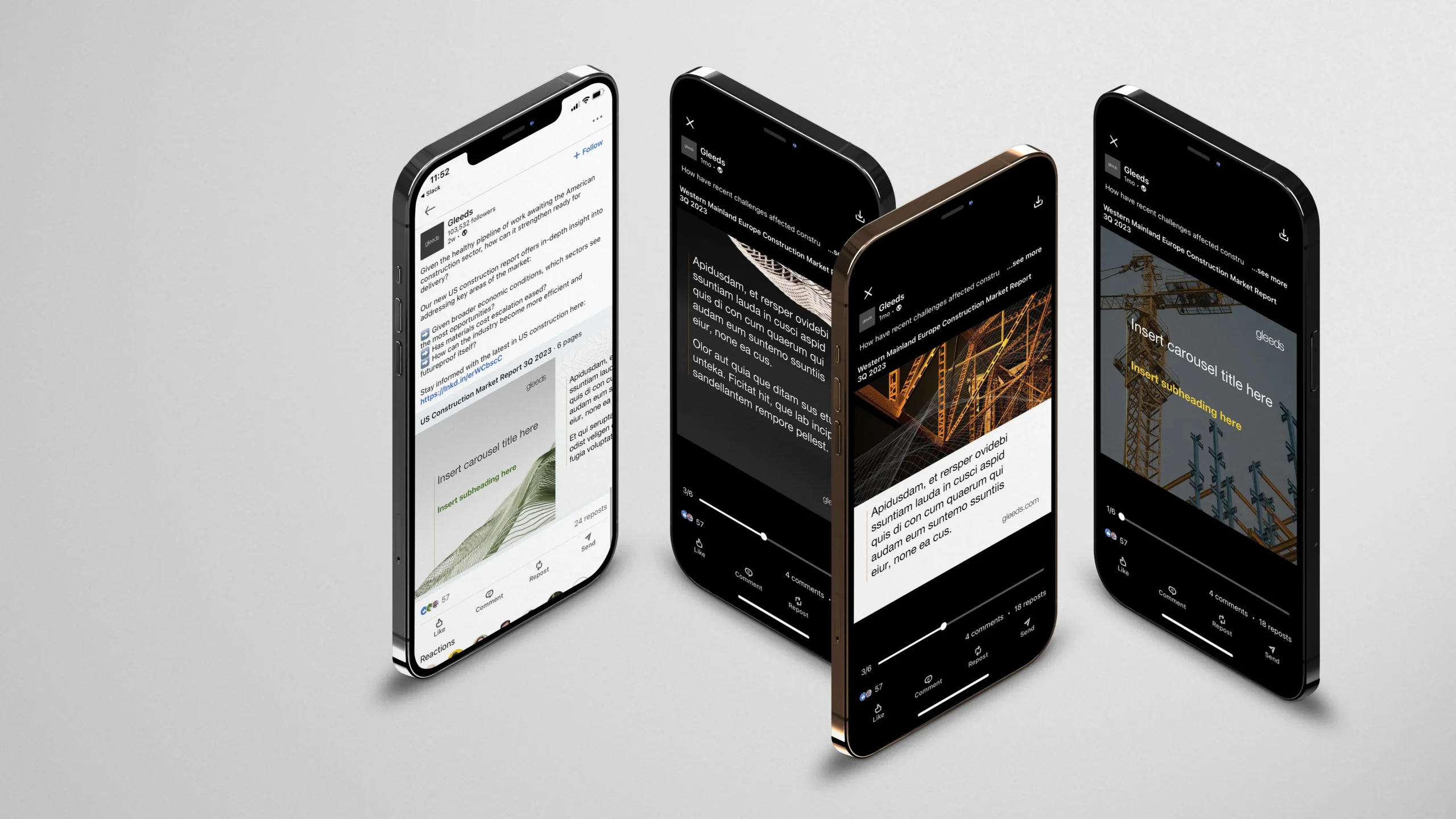
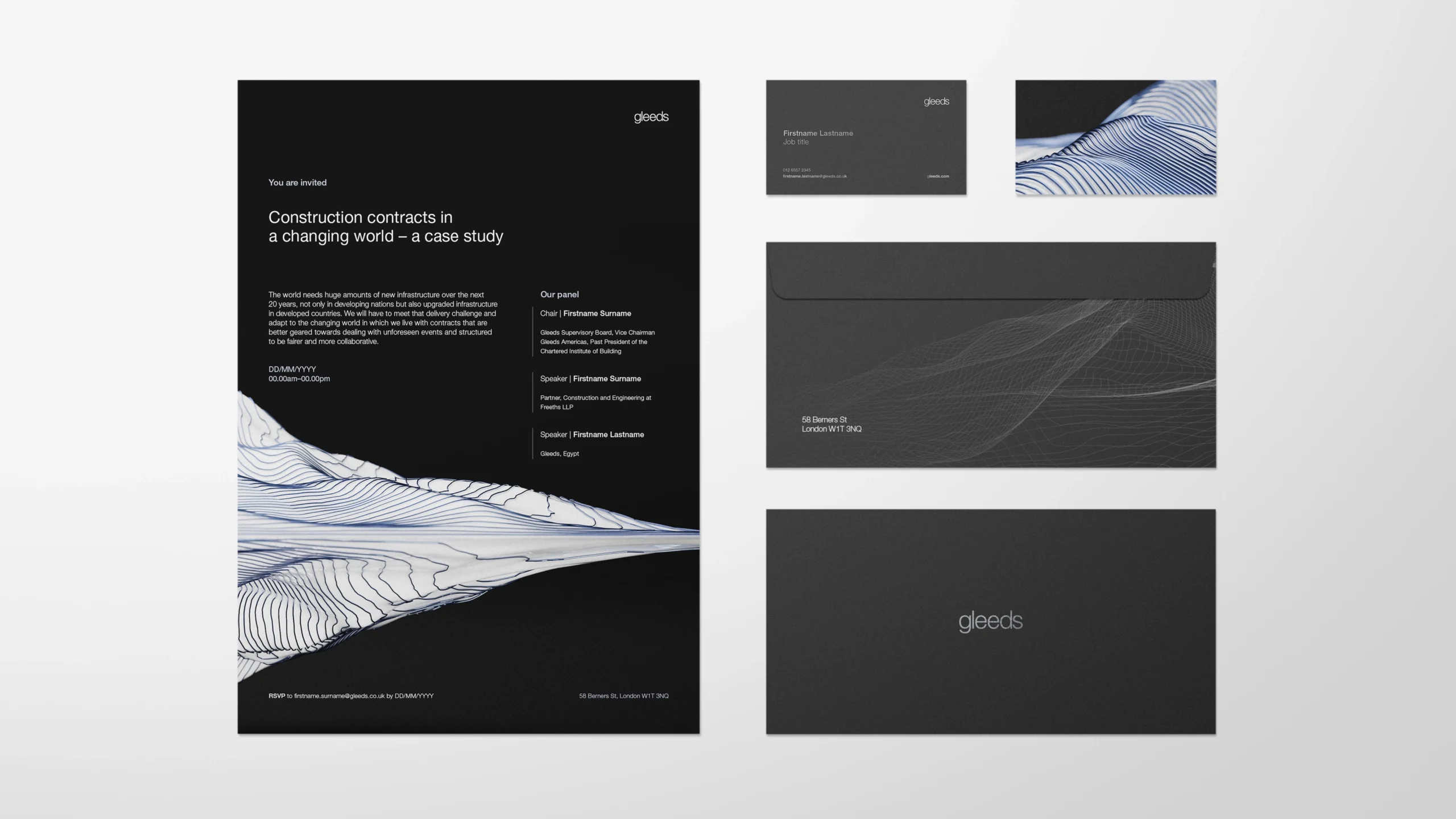
While the Strand functions as a three-dimensional device, it also unravels seamlessly into a flexible library of two-dimensional assets. These can be layered over photography, motion or colour, providing a toolkit that is modular, instantly recognisable and infinitely adaptable, enabling Gleeds to scale its identity with ease across any application.
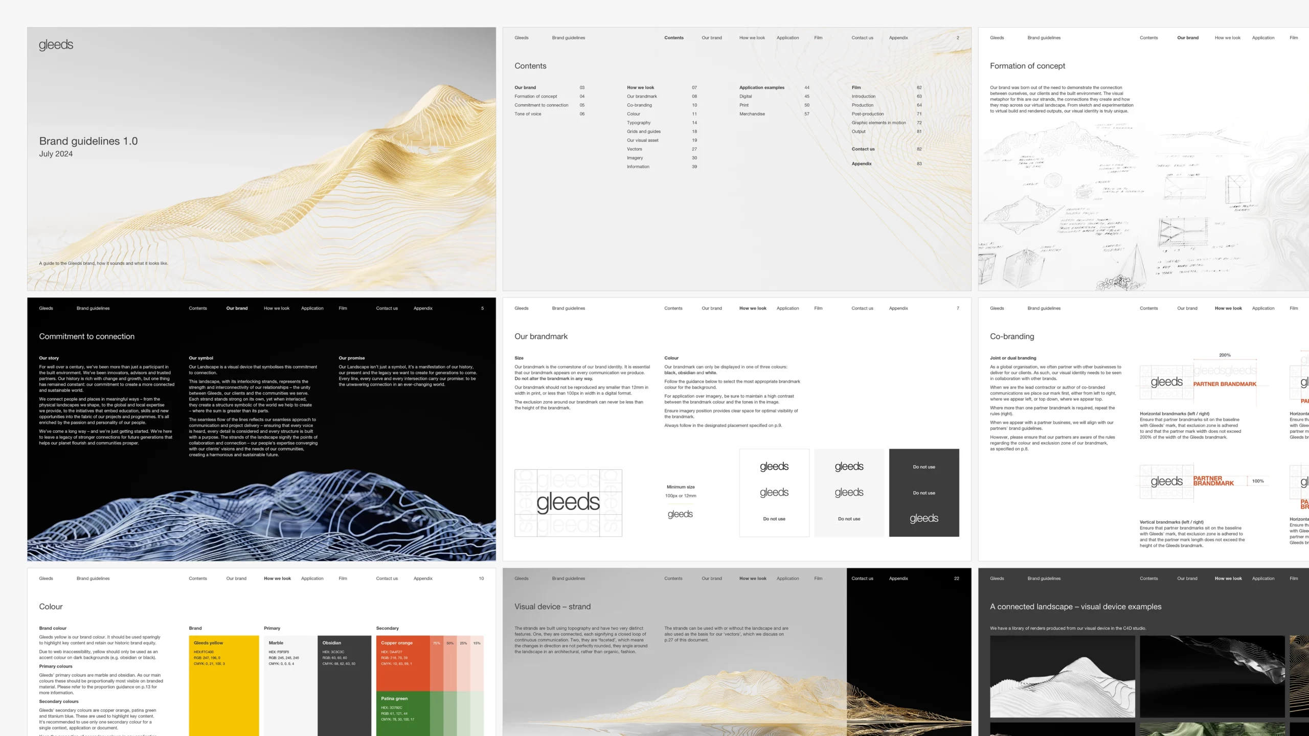
The iconic Gleeds Yellow was retained as a primary anchor, but this was expanded with a palette inspired by the materials the consultancy engages with every day – concrete tones, mineral shades and earthy, elemental hues.
Ultimately, what was created was not simply a rebrand but a reframing of Gleeds’ role within its industry. By shifting the narrative from being a consultancy perceived as part of the background process to one that actively shapes, guides and delivers construction outcomes, Gleeds’ value is now made visible.
Whether you are facing market disruption, seeking to reposition your offering or simply need to articulate your unique value more effectively, we would love to show you how we can help. Get in touch.












Concept development

Explore our work
Original thinkers. Proven creators.
Digital Legal Exchange – Defining Legal X

AlixPartners – Visualising impact

Akin – New dimensions of distinction

AMS – People powered positioning
Fleet Management Limited – Navigating reform

AlixPartners – Product films

Within International – AI (Actual intelligence)

DLA Piper – Tech Index 2022
The Tech Index report is a biannual report published by long standing client DLA Piper exploring current issues and trends.

Peters & Peters – Precision in duality
Celebrating the launch of Peters & Peters’ new brand, fresh off our studio press.

DLA Piper – Our word is our brand
A brilliantly brave client using their visual identity to communicate a story, not just a look.

QBE – EQUITY Programme
Why campaigns driven by research, analysis and strategic counsel go further.