

Brand

Akin Gump Strauss Hauer & Feld LLP (Akin) is an international firm known for its pragmatic focus and dynamic approach to providing creative and strategic solutions to complex challenges across global markets.
What sets Akin apart is the breadth and depth of its expertise in a multitude of sectors, which does not only define the firm’s identity but also position it uniquely within the legal industry, distinguishing it from many of its competitors.
Working in close collaboration with the Chief Strategy and Growth Office, Akin sought a partner who could help navigate their strategic challenges, articulate them with clarity and transform their brand in a way that would visualise their meaningful distinction and cut through in the market.

From flat to faceted
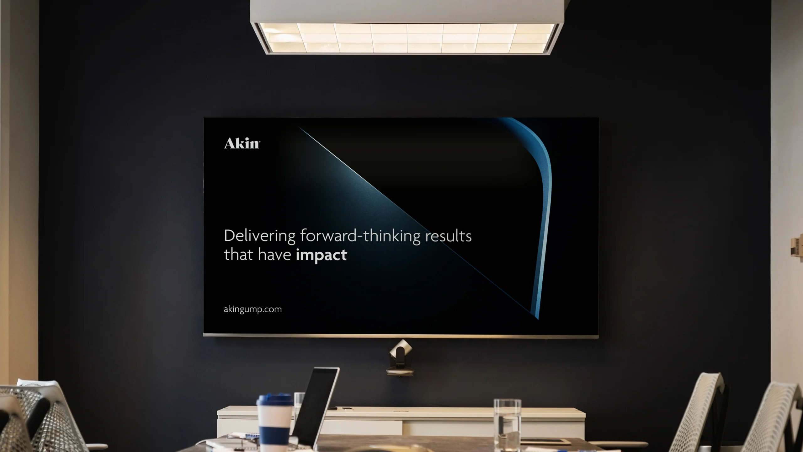
To enhance the quality, clarity and overall impact of Akin’s communications, we began with a comprehensive review of their existing presentations and visual identity. This process involved analysing the strengths and limitations of their current materials and exploring ways to visually represent the firm’s sophistication, multifaceted expertise and global presence.
Building on these insights, we reimagined the brand mark in a three-dimensional form within a virtual Cinema 4D environment, introducing depth, texture and movement strategically to create a device that reflects Akin’s agile, forward-thinking character.
This evolution not only enhanced the mark itself but also established a versatile foundation for greater exploration of colour and form, creating a bespoke image library that has been effectively utilised across presentations, collateral and other digital touch points.
Since then, we have created a suite of marketing materials, featuring internal and external presentations, brochures, both static and animated digital ads, social media assets and HTML email templates – ensuring the refreshed visuals resonate across every platform and audience.









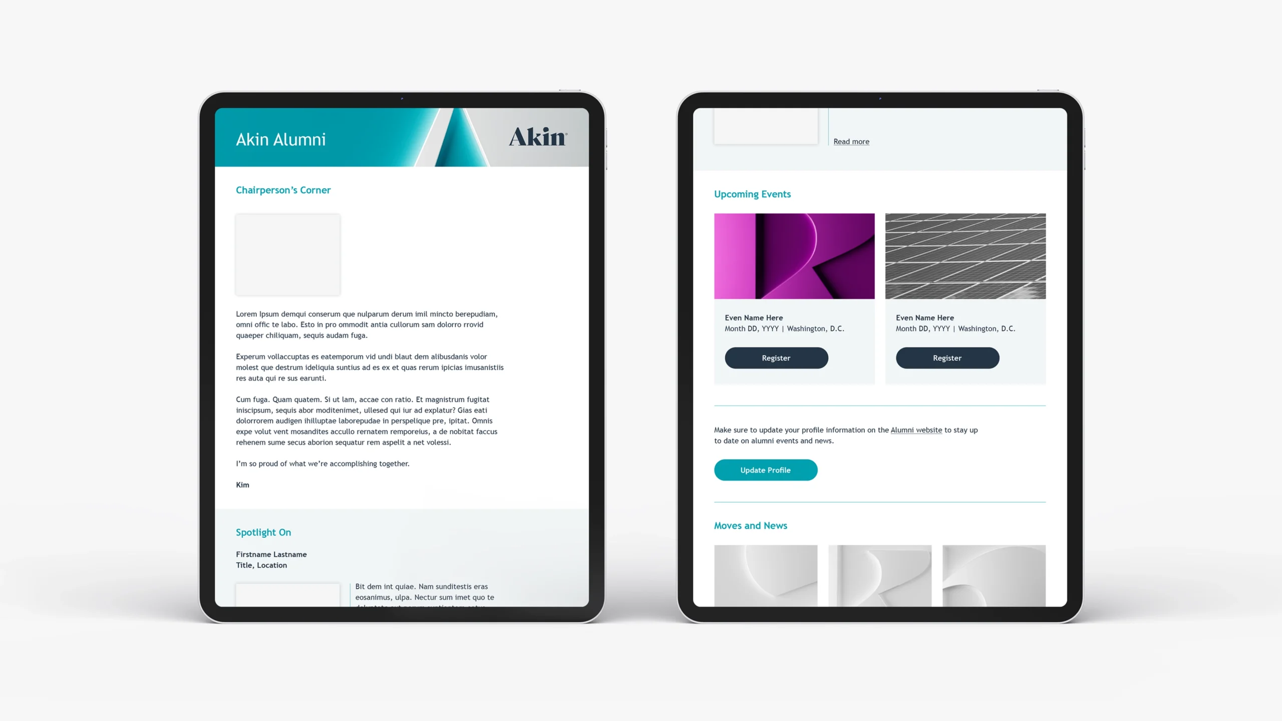




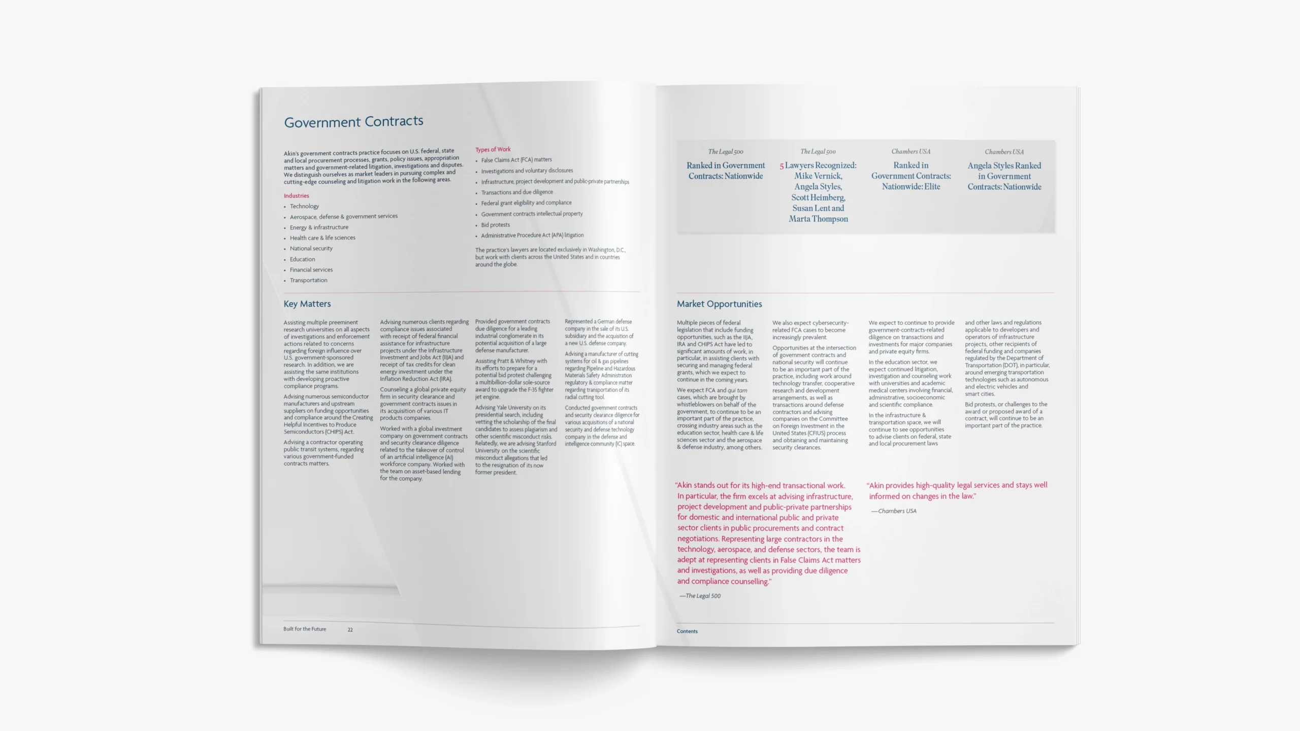

Further outputs

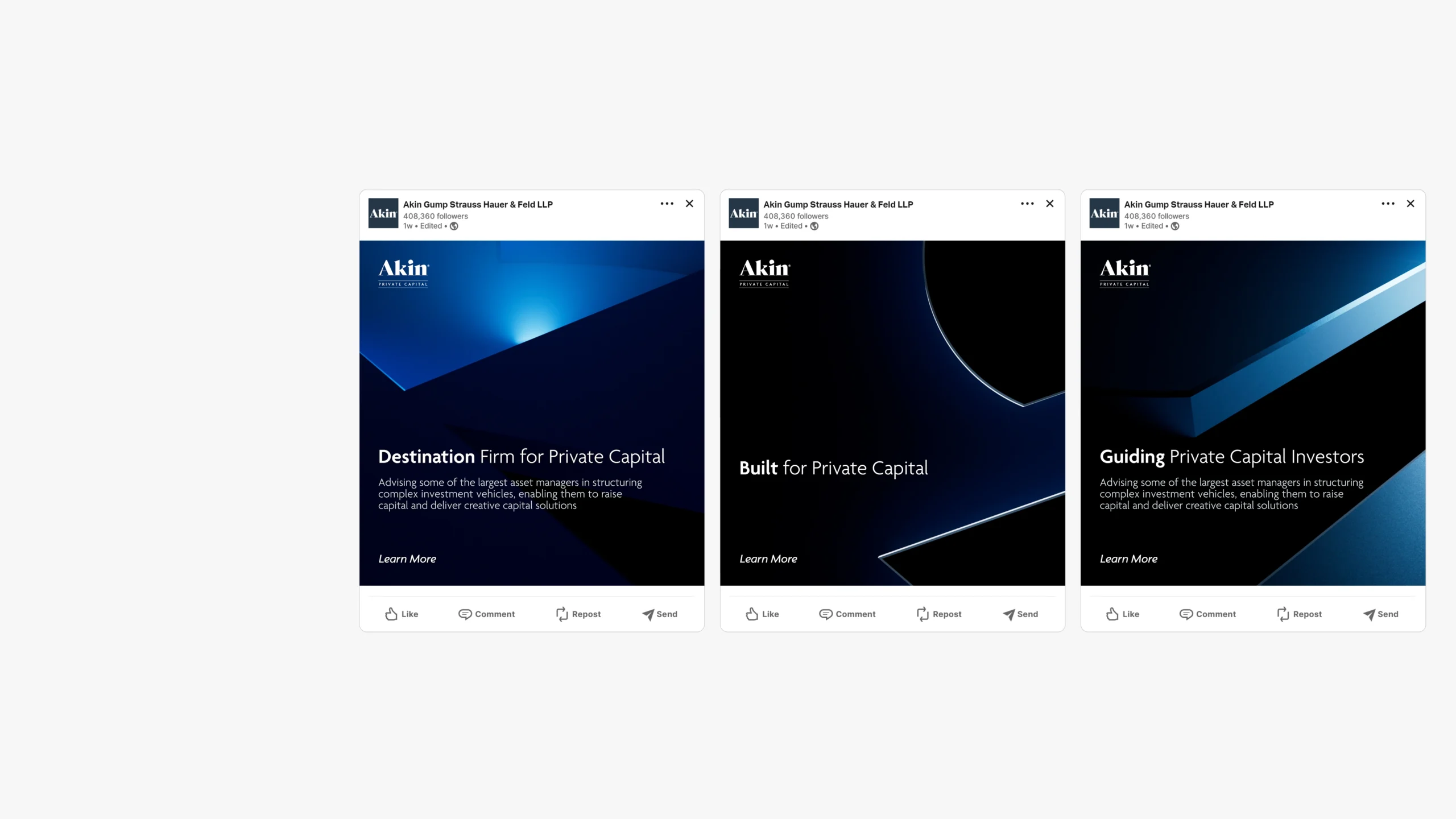
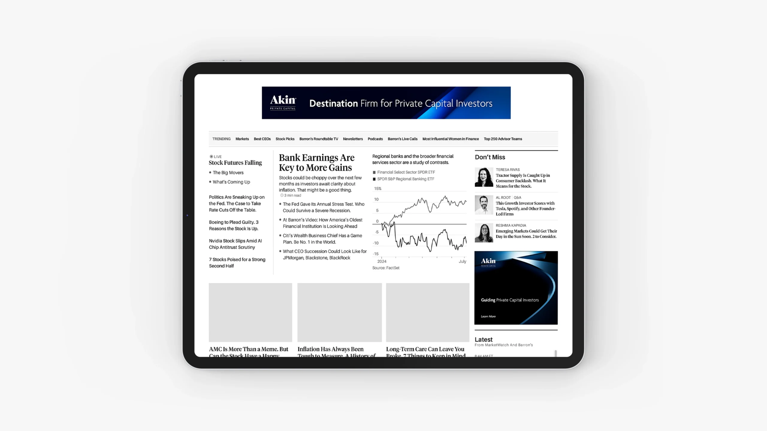



Concept development






Explore our work
Original thinkers. Proven creators.
Digital Legal Exchange – Defining Legal X

AlixPartners – Visualising impact

Gleeds – Navigating abstract landscape

AMS – People powered positioning
Fleet Management Limited – Navigating reform

AlixPartners – Product films

Within International – AI (Actual intelligence)

DLA Piper – Tech Index 2022
The Tech Index report is a biannual report published by long standing client DLA Piper exploring current issues and trends.

Peters & Peters – Precision in duality
Celebrating the launch of Peters & Peters’ new brand, fresh off our studio press.

DLA Piper – Our word is our brand
A brilliantly brave client using their visual identity to communicate a story, not just a look.

QBE – EQUITY Programme
Why campaigns driven by research, analysis and strategic counsel go further.