Within
International
01 /
Advisory
02 /
Brand
03 /
Digital
04 /
Film & Animation
Within International was founded in 2006 with a primary focus on enhancing how the world’s leading businesses communicate. Working across multiple sectors within professional services, we deliberately select clients that others do not understand the importance of.
We have built an enviable reputation for exceptional work by blending the best in communications expertise and creative talent with commercial acumen and technology. Ultimately, our intention is to bring the same quality and thought to intangible products and services as we see with tangible ones.
We offer services in brand, film and animation but our techniques and skills are not based on art – they are a response to business needs and the principles of accuracy, brevity and conciseness. We use data to drive our thinking and research to complement our creativity.
Our process is designed to enable businesses to achieve their full potential, and as a prerequisite we put clients at the centre of everything we do. We are called ‘Within’ because we were designed to feel like an extension of an in-house team.

Selected work


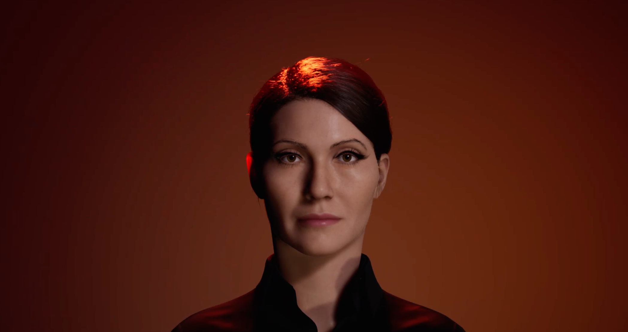
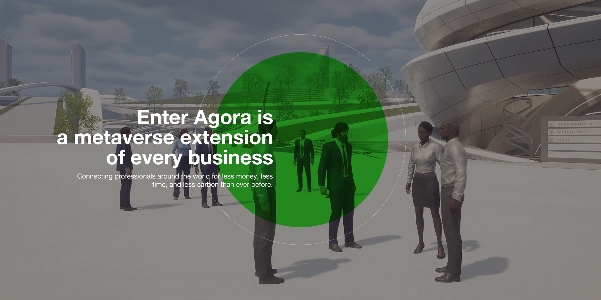
Enter Agora
Enter Agora is a metaverse extension of every business. Connecting professionals around the world for less money, less time, and less carbon than ever before.
We monetise your world through advertising, sponsorship, payment, and data analytics.
Enter Agora is designed to reflect the quality of your brand, and to engage your stakeholders in the sophisticated manner that they expect from you.